KISS – Keep it Simple and Stupid
I recently designed and built a new personal website for myself. I want to show it to you and explain the thoughts behind it and why I kept it so simple.
Why a new website
In my earlier years as a designer, I relaunched my website probably 3-4x a year, which is extremely often compared to the masses.
My previous website has made it to an age of nearly one year – then, I decided to create a new much more simplified one:
The old website was the initial version of Dashfolio, my most successful Framer template of 2023.
It had many sections about my projects, some of my articles, my newsletters, my products, templates, and so on. It was a big kind of library of everything I did. It was perfect for that time back then. I only had my brand and was selling Framer templates. I was a creator. Once the business grew, I decided to expand it to its own brand. Canvas Supply was born.
I felt like I had been growing out of just keeping everything under my brand. I had multiple ventures under my belt, and somehow, my website only reflected the template business.
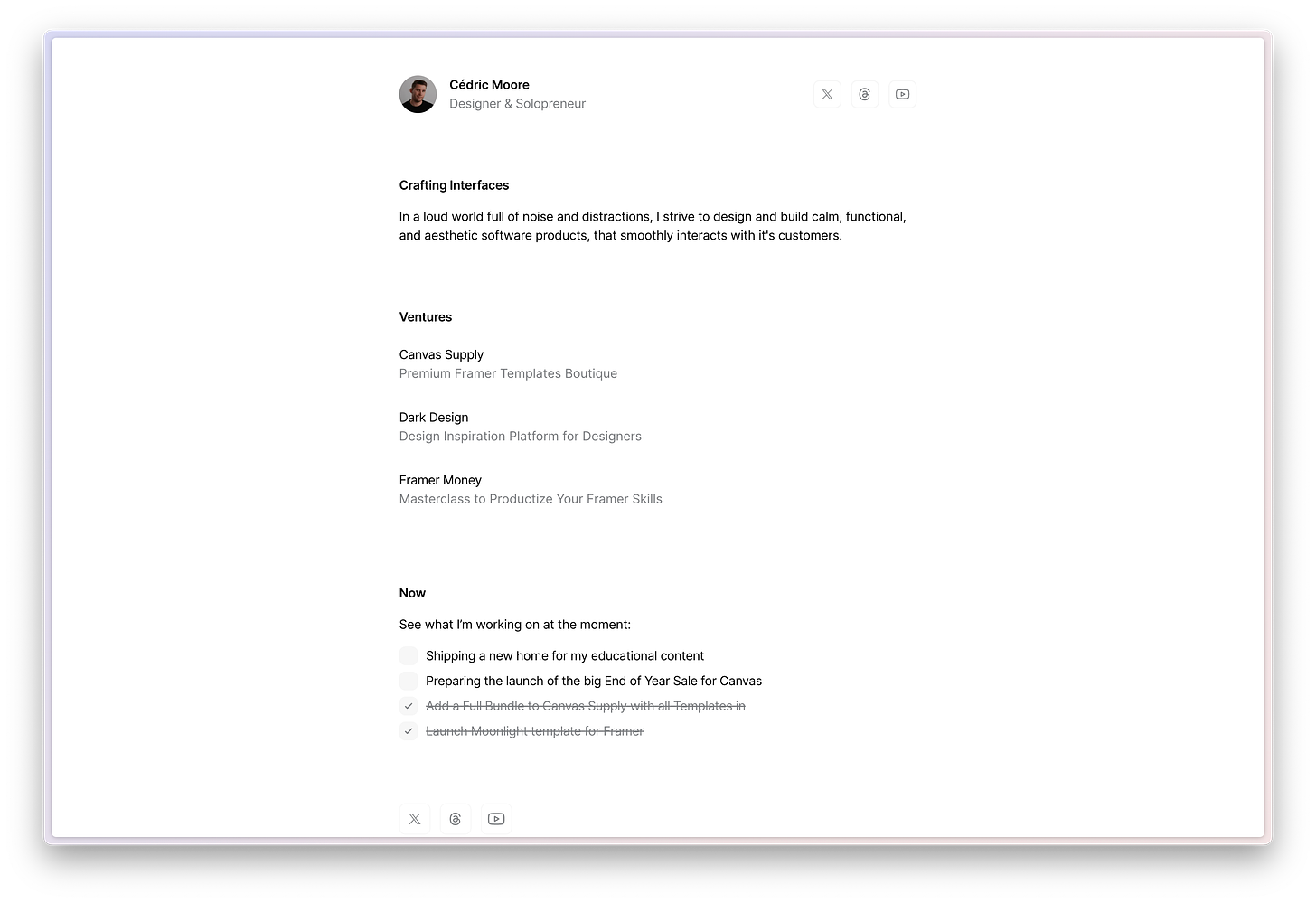
I needed a change. A new website, that reflects and shows all ventures I’ve built in a simple overview so visitors can easily browse through them.
There are 4 ventures right now:
Canvas Supply
Creative Prosperity
Dark Design
Framer Money
The goal of the new website was reached. But I wanted to not only show what I do but also share what I am working on at the moment. To solve this, the Now section has been built in. It’s a checklist-styled list of the things I am working on right now:
It’s here to give my audience additional information about my work and its current status.
Why KISS?
The Keep it Simple & Stupid method is something I usually make use of a lot in every piece of work I create. There are a few reasons why I used it for my site this time as well:
Save time
Nobody has time for personal sites, and if so, you either don’t run a business or you are just bored. I decided to create a new website in the morning and shipped it 3h later. Let’s not overcomplicate things.
Focus on the essentials
I had two goals for this website. Direct my viewers directly to my value-packed tools and resources, and show what I’m doing right now. I didn’t want to have all my blog posts on there, since they have been on Creative Prosperity for a few months on their platform. Also, all other content like the products is on Canvas Supply only. No need for duplicated products on two websites which also meant doubled maintenance efforts. I channeled them all in each specific platform on its own.
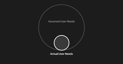
As you can see, it depends on your goals of whether your website is a fit for KISS or not. But usually, it’s a good direction, since our fellow users, visitors, and customers don’t think about how creative or crazy a website has been designed. They just wanna fulfill their own goals, like purchasing or reading something. Let’s not make it more complex for them as it needs to be.
Let’s keep it simple and stupid.
Whenever you're ready, there are 4 ways I can help you:
Framer Money Course: The formula for starting and scaling your own Framer template business. With no ads, I’ve made $55K+ in revenue with my templates.
Framer Templates: Website templates for personal websites, eCommerce stores, portfolios, or startup websites. Accessible, aesthetic, simple, and easy to customize in Framer.
Dark Design: Get inspired by hundreds of dark-themed websites and show yourself to thousands of potential customers.
Promote yourself to 1.2K+ subscribers by sponsoring this newsletter.


